By
By
What is Explainability?
Explainability is one of the most important topics you can learn and apply in Machine Learning and Data Science. Building a model that performs well is one thing, the ability to help you and others understand why a model produces the outcomes it does is another.
Let's take an example. Let's say you're building a machine learning model that will predict the likelihood that a customer will purchase a product. We might have different demographic information about them, we might have information about other products they consume, and we might have marketing information about them. Simply predicting the likelihood that a customer will purchase a product is not enough, and we need to understand why they purchase.
By understanding the key drivers of the model, we might be able to improve sales conversion rates by focusing on those key drivers. For example, we know that people are more likely to convert during certain times of the month or times of the day; we can focus our sales efforts around those windows of time that are more productive.
Now think back to your basic statistics classes and learning about simple linear regression. We all probably remember the equation of a line: Y = MX + B. We utilize this equation and the coefficients to predict new values for Y. The same goes for many machine learning models. If we can explain how each of the features of a model affects the outcome, we can help others understand how it works. For more on simple linear regression, check out my article: Learn Excel’s Powerful Tools for Linear Regression. We'll cover three key ways to explain your model. Let's jump in!
- Coefficients for Linear and Logistic Regression
- Feature Importance
- SHAP Values
Data and Imports
For our demonstration today, we will use the Bank Marketing UCI dataset, which one can find on Kaggle. This dataset contains information about Bank customers in a marketing campaign and a target variable that one can utilize in a classification model. This dataset is in the public domain under CC0: Public Domain and can be used for any purpose.
For more information on building classification models, check out: Everything You Need to Know to Build an Amazing Binary Classifier and Go Beyond Binary Classification with Multiclass and Multi-Label Models. Additionally, check out a closely related article 4 Methods that Power Feature Selection in a Machine Learning Model
We will start by importing the necessary libraries and loading the data. We'll be utilizing Scikit-Learn for each of our different techniques.
import pandas as pd

from sklearn.model_selection import train_test_split
from sklearn.ensemble import RandomForestClassifier
from sklearn.linear_model import LogisticRegression
from sklearn.preprocessing import MinMaxScaler
from sklearn.compose import ColumnTransformer
from sklearn.preprocessing import LabelEncoder
from sklearn.preprocessing import OrdinalEncoder
from sklearn.compose import make_column_selector as selector
from sklearn.pipeline import Pipeline

import xgboost
import shap

import matplotlib.pyplot as plt
import seaborn as sns

df = pd.read_csv("bank.csv", delimiter=";")

# This column has too much effect on the model, so we'll drop it
df = df.drop(["duration"], axis=1)
Data Prep
The first thing we need to do with this dataset is separate our target variable from the rest of the data. Since this is conveniently located in the last column, we can use the iloc function to separate it.
# Separate the target variable from the rest of the data
X = df.iloc[:, :-1]
y = df.iloc[:,-1]
As always, we want to prepare our data for machine learning. That means encoding categorical values, vectorizing text (when appropriate), and scaling numeric values. I always use pipelines to ensure that I have a consistent transformation of my data. Check out my article, Stop Building Your Models One Step at a Time. Automate the Process with Pipelines!, for more information on pipelines.
We'll utilize a ColumnTransformer and apply the MinMaxScaler to numeric data and the OrdinalEncoder to categorical data. There are many strategies for encoding data, such as the OneHotencoder. However, for the purposes of explainability, we will end up with a more interpretable model set of results by simply using the Ordinal Encoder since the column will remain as a single column vs. multiple columns for each categorical value.
column_trans = ColumnTransformer(transformers=
        [('num', MinMaxScaler(), selector(dtype_exclude="object")),
        ('cat', OrdinalEncoder(), selector(dtype_include="object"))],
        remainder='drop')
It's also a best practice to utilize the LabelEncoder on our y value to ensure that it is encoded as a numeric value.
# Encode the target variable
le = LabelEncoder()
y = le.fit_transform(y)
And finally, before we start, we'll split our data into training and testing sets.
# Split the data into 30% test and 70% training
X_train, X_test, y_train, y_test = train_test_split(X, y, test_size=0.3, random_state=0)
Coefficients for Linear and Logistic Regression
As mentioned in the introduction, Linear and Logistic models are wonderfully interpretable. We can easily extract the coefficients for each feature and use them to explain the model. If your data is suitable for Linear or Logistic Regression, they tend to be one of the best models for explainability. You can apply a mathematical weight to each feature regarding its effect on the outcome. Let's take a look at an example on our dataset.
We'll start by creating an instance of our classifier and pipeline and fitting it to our training data.
# Create a random forest classifier for feature importance
clf = LogisticRegression(random_state=42,
                             max_iter=1000,
                             class_weight='balanced')

pipeline = Pipeline([('prep',column_trans),
                        ('clf', clf)])

# Fit the model to the data
pipeline.fit(X_train, y_train)
Now that we have our fit pipeline, we can extract some information from it. Here we're extracting the coefficients for each feature by calling the coef_ attribute of the classifier in our pipeline.
pipeline['clf'].coef_[0]
array([ 0.75471553, -1.11473323, -0.0714886 , -3.2587945 ,  1.78373751,
        2.61506079,  0.02806859,  0.13490259,  0.1151557 ,  0.09080435,
       -0.47980448, -0.82908536, -0.5171127 ,  0.01441912,  0.14207762])
You can see each coefficient, positive or negative, for each column in the dataset. We'll make this easier to read in a moment. Before we do that, let's also look at the intercept_.
pipeline['clf'].intercept_[0]
-0.5418635990682154
Let's display the coefficients in a more readable format. We'll start by creating a data frame with the coefficients and the column names.
feat_list = []
total_importance = 0
# Make a dataframe of Coefficients and Feature Names
for feature in zip(X, pipeline['clf'].coef_[0]):
    feat_list.append(feature)
    total_importance += feature[1]

# create DataFrame using data
df_imp = pd.DataFrame(feat_list, columns =['FEATURE', 'COEFFICIENT']).\
                      sort_values(by='IMPORTANCE', ascending=False)
df_imp.sort_values(by='IMPORTANCE', ascending=False)
      FEATURE  COEFFICIENT
5     balance     2.615061
4     default     1.783738
0         age     0.754716
14   poutcome     0.142078
7        loan     0.134903
8     contact     0.115156
9         day     0.090804
6     housing     0.028069
13   previous     0.014419
2     marital    -0.071489
10      month    -0.479804
12      pdays    -0.517113
11   campaign    -0.829085
1         job    -1.114733
3   education    -3.258795
Now we can easily see how much effect each feature has on the outcome of the model. For example balance has a coefficient of 2.615061. This means that for every unit increase in balance, the odds of a positive outcome increase by 2.615061. We can also see that education has a coefficient of -3.258795. This means that for every unit increase in education, the probability of a positive outcome decreases by -3.258795.
A way that you could communicate with sales and marketing in this case would be "focus on people with higher balance levels and avoid people with lower levels of education".
Feature Importance
Next, for tree based classifiers and regressors, we can output Feature Importance. This is a wonderful capability to both select the most impactful features as well as to help explain the model. Let's take a look at an example using our dataset. We'll start the same way as before as creating an instance of the classifier and pipeline and then fitting it to our training data.
# Create a random forest classifier for feature importance
clf = RandomForestClassifier(random_state=42,
                             n_jobs=6,
                             class_weight='balanced')

pipeline = Pipeline([('prep',column_trans),
                        ('clf', clf)])

pipeline.fit(X_train, y_train)
Similar to the coef_ attribute of Logistic Regression, we have a feature_importances_attribute that provides us the relative importance. Unlike the coefficients, the feature importance is a relative measure of the importance of each feature. The sum of all feature importances is equal to 1. You can consider these as the relative importance, vs. a mathematical weight.
pipeline['clf'].feature_importances_
array([0.15169613, 0.1668886 , 0.13429024, 0.07288524, 0.05647985,
       0.02818437, 0.07880281, 0.03797838, 0.04328934, 0.00404282,
       0.02838248, 0.02165701, 0.04896554, 0.09215941, 0.03429777])
And let's display the feature importance in a more readable format. We'll start by creating a dataframe with the feature importance and the column names and the cumulative sum of all feature importances.
feat_list = []

total_importance = 0
# Print the name and gini importance of each feature
for feature in zip(X, pipeline['clf'].feature_importances_):
    feat_list.append(feature)
    total_importance += feature[1]

# create DataFrame using data
df_imp = pd.DataFrame(feat_list, columns =['FEATURE', 'IMPORTANCE']).\
                      sort_values(by='IMPORTANCE', ascending=False)
df_imp['CUMSUM'] = df_imp['IMPORTANCE'].cumsum()
df_imp
      FEATURE  IMPORTANCE    CUMSUM
1         job    0.166889  0.166889
0         age    0.151696  0.318585
2     marital    0.134290  0.452875
13   previous    0.092159  0.545034
6     housing    0.078803  0.623837
3   education    0.072885  0.696722
4     default    0.056480  0.753202
12      pdays    0.048966  0.802168
8     contact    0.043289  0.845457
7        loan    0.037978  0.883436
14   poutcome    0.034298  0.917733
10      month    0.028382  0.946116
5     balance    0.028184  0.974300
11   campaign    0.021657  0.995957
9         day    0.004043  1.000000
We can see that job is the most important feature, followed by age and marital. Again, note that this is a little different than the way we looked at coefficients. For example, ageis very interpretable with the coefficents since the larger the number the older the person is, but with job, we have an encoded feature that is not truly ordinal making it make less sense with coefficients but more sense with feature importance. This is something to consider with your pipeline and encoding strategy - how will you interpret the results?
SHAP Values
SHAP, which stands for SHapley Additive exPlanations, is a state-of-the-art Machine Learning explainability. This algorithm was first published in 2017 by Lundberg and Leeand is a way to reverse-engineer the output of any predictive algorithm.
SHAP is based on a concept from game theory where we have the game of reproducing the model's outcome, and players are the features included in the model. SHAP quantifies the contribution that each player brings to the game.
Let's take a look at how SHAP works on our dataset. We'll start by creating an instance of the classifier, in this case, the ever-popular XGBoost, and pipeline and then fitting it to our training data.
clf = xgboost.XGBRegressor()

pipeline = Pipeline([('prep',column_trans),
                        ('clf', clf)])

pipeline.fit(X_train, y_train);
model = pipeline['clf']

# explain the model's predictions using SHAP
explainer = shap.Explainer(model,
                           pipeline['prep'].transform(X_train),
                           feature_names=X_train.columns)
shap_values = explainer(pipeline['prep'].transform(X_train))

# visualize the first prediction's explanation
fig = shap.plots.waterfall(shap_values[1])
plt.tight_layout()
plt.savefig('explainability_01.png', dpi=300);
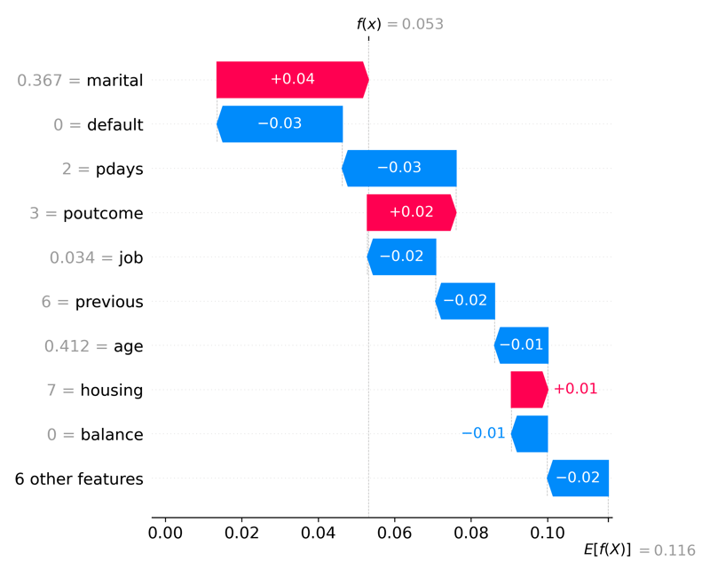
Waterfall plots display explanations for an individual prediction. Each row shows how each feature's positive (red) or negative (blue) contribution moves the value from the expected model output for this prediction.
Looking at the x-axis, we can see the expected value is E[f(x)] = 0.112. This value is the average predicted number across all observations. The ending value is f(x) = 0.053 and is the predicted number for this observation. In this example, we have a binary target value, so this prediction is very close to 0 or a customer that will fail to convert in the marketing campaign). The SHAP values are all the values in between. For example, a positive change in marital status will increase the probability of a positive outcome by 0.04.
Conclusion
Model Explainability in Machine Learning is one of the most important concepts you can learn and implement in your practice. Understanding how to explain why your model performs the way it does can translate into better business decisions and more trust in your models. In this post, we looked at several ways to explain our model. We looked at the coefficients of Logistic Regression, the feature importance of our Random Forest model, and the SHAP values of our XGBoost model. You can use each of these methods to explain your model and help you understand why your model is making the predictions it is making. Happy model building!
All of the code for this post is available on GitHub