My Goto Process for Exploratory Data Analysis with Python
What is EDA?
EDA, or Exploratory Data Analysis, is the process of examining and understanding the structure of a dataset. It's a critical part of any machine learning project, and it is the tool in your toolbox that allows you to approach data you've never seen before and get comfortable with all sorts of characteristics.
I find that many people jump right into their data without first properly performing EDA. Especially after they've done a few projects and think they know what they're doing. To me, this is a critical first step that uncovers so many hidden gems in the data it's indispensable.
My Approach to EDA
This article describes the generalized process I use to perform EDA. It can vary from dataset to dataset, depending on the type of data, the complexity, and the messiness. However, these steps are generally the same for all datasets.
- Basic Exploration
- Check for Null & Duplicate Values
- Dealing with Outliers
- Visualize the Data
Basic Exploration
Start by importing the needed packages. These are my go-to defaults for all fresh explorations. I tend to find seaborn is a convenient wrapper on top of matplotlib that helps build visualizations faster.
 import numpy as np
import pandas as pd
import seaborn as sns
import matplotlib.pyplot as plt
See the Size, Columns, and Sample Rows
After I import data there are a few functions from pandas that I run before anything else. Let's go through them.
df.shape
(4521, 17)
We can see from the output that there are 4,521 observations with 17 columns.
df.info()
 <class 'pandas.core.frame.DataFrame'>
RangeIndex: 4521 entries, 0 to 4520
Data columns (total 17 columns):
 #   Column     Non-Null Count  Dtype
---  ------     --------------  -----
 0   age        4521 non-null   int64
 1   job        4521 non-null   object
 2   marital    4521 non-null   object
 3   education  4521 non-null   object
 4   default    4521 non-null   object
 5   balance    4521 non-null   int64
 6   housing    4521 non-null   object
 7   loan       4521 non-null   object
 8   contact    4521 non-null   object
 9   day        4521 non-null   int64
 10  month      4521 non-null   object
 11  duration   4521 non-null   int64
 12  campaign   4521 non-null   int64
 13  pdays      4521 non-null   int64
 14  previous   4521 non-null   int64
 15  poutcome   4521 non-null   object
 16  y          4521 non-null   object
dtypes: int64(7), object(10)
memory usage: 600.6+ KB
The way that pandas imports data is to give the best guess at datatypes. You could change them later if they didn't import properly. In my case above, it looks like most of the data types are integers and objects or strings.
Next, display the first and last few rows of data.
df.head()
and
df.tail()
See a Statistical Summary
There is a super powerful command that in a single function, df.describe() can give you a birds-eye view of your data. It will show counts, mean, standard deviation, min, max, and more. With this data, you can get a pretty good sense of what you're up against; however, visualizing this later will add to your analysis.
 # Without an parameters passed into the describe function, it will return numerical only.
df.describe().round(2)
            age   balance      day  duration  campaign    pdays  previous
count  4521.00   4521.00  4521.00   4521.00   4521.00  4521.00   4521.00
mean     41.17   1422.66    15.92    263.96      2.79    39.77      0.54
std      10.58   3009.64     8.25    259.86      3.11   100.12      1.69
min      19.00  -3313.00     1.00      4.00      1.00    -1.00      0.00
25%      33.00     69.00     9.00    104.00      1.00    -1.00      0.00
50%      39.00    444.00    16.00    185.00      2.00    -1.00      0.00
75%      49.00   1480.00    21.00    329.00      3.00    -1.00      0.00
max      87.00  71188.00    31.00   3025.00     50.00   871.00     25.00
Inspect Categorical Values
The following function is a really handy one when dealing with categorical data. It first selects just the columns of type object; in our case, all text fields are truly categorical. Then it loops over each of those columns and prints the value_counts of each.
 # get categorical data
cat_data = df.select_dtypes(include=['object'])
# show counts values of each categorical variable
for colname in cat_data.columns:
    print (colname)
    print (cat_data[colname].value_counts(), '\n')
Here is what an example output looks like for a single column. Notice how great that summarizes categorical data.
 marital
married     2797
single      1196
divorced     528
Name: marital, dtype: int64
Check for Null & Duplicate Values
Both null values and duplicate values end up being an issue in Machine Learning models, so let's check for and deal with them.
Null Values
First, I start by testing for null values. It will take a bit of exploration and interpretation to know how you want to deal with them. It can range from simply dropping them when there is a very small amount, filling them with a default value such as 0, or filling them based on adjacent values. Filling them based on adjacent values is common with time-series data where you might fill a missing value with the mean of the prior and following values. Pandas have extensive support with their fillna() function that you can read about in the Pandas documentation.
For this example, I'll explore if there are any and drop them from the dataset.
 # check for nan/null
df.isnull().values.any()
# count of nulls per column
df.isnull().sum()
and to drop them
 # Drop NULL values
df.dropna(inplace=True)
Duplicate Values
Next, in order is to look for duplicates. Duplicates are similar to null values because they need to be interpreted as actual clean, useful data or erroneous data. Duplicates can also be a problem in Machine Learning because they could cause your model to over-bias to observations that aren't part of the real dataset. You can utilize the below code to either check for duplicates or to drop them as is implemented here:
 len_before = df.shape[0]
df.drop_duplicates(inplace=True)
len_after = df.shape[0]

print(f"Before = {len_before}")
print(f"After = {len_after}")
print("")
print(f"Total Removed = {len_before - len_after}")
 Before = 4521
After = 4521

Total Removed = 0
There were no duplicate rows or null values in this case, but it's very important to check and handle them appropriately for your use case.
Dealing with Outliers
Outliers are another extremely common issue in data. Outliers need to be assessed if they are good observations in the dataset or if they are errors. First, you can test for how many there are. On normally distributed data, the most common method is to look for any observations that lie outside +/- 3 standard deviations. If you remember back to your statistics class, the 68-95-99.7 rule. This rule states that 99.7% of all data in a normal distribution lies within three standard deviations of the mean. When your data is highly left or right-skewed, this will not be true. You can utilize box plots or histograms to test for normality. I'll cover that below.
 def get_outliers(df):
    '''Identify the number of outliers +/- 3 standard deviations.
    Pass this function a dataframe and it returns a dictionary'''

    outs = {}

    df = df.select_dtypes(include=['int64'])


    for col in df.columns:

        # calculate summary statistics
        data_mean, data_std = np.mean(df[col]), np.std(df[col])

        # identify outliers
        cut_off = data_std * 3
        lower, upper = data_mean - cut_off, data_mean + cut_off

        # identify outliers
        outliers = [x for x in df[col] if x < lower or x > upper]

        outs[col] = len(outliers)

    return outs
Then pass the dataframe into the function to return the number of outliers.
get_outliers(df)
 {'age': 44,
 'balance': 88,
 'day': 0,
 'duration': 88,
 'campaign': 87,
 'pdays': 171,
 'previous': 99}
A good tip is to consider plotting the identified outlier values, perhaps in the context of non-outlier values to see if there are any systematic relationship or pattern to the outliers. If there is, perhaps they are not outliers and can be explained, or perhaps the outliers themselves can be identified more systematically 1.
Removing Outliers
Should you choose to drop outliers from your dataset, here is a simple method to do so. From scipy.stats, you can use the zscore function to identify outliers, similar to the above method easily:
 from scipy import stats

# build a list of columns that you wish to remove ouliers from
out_list = ['balance', 'pdays', 'duration']

# overwrite the dataframe with outlier rows removed.
df = df[((np.abs(stats.zscore(df[out_list])) < 3)).all(axis=1)]
Visualize the Data
I like to break my visualizations into two different parts. Explicitly first utilizing only univariate plots or plots such as histograms and boxplots on single variables. Then I tend to layer in bivariate (or multi-variate) plots across different variables. This process helps me to break down the analysis into layers of understanding of the data.
Univariate Plots
A univariate plot is exactly as it sounds-a plot against a single variable. Let's start by looking at box plots of all the numeric variables in the dataset. Let's start with the two most common, a box plot and a histogram.
Box Plots
A box plot takes a single variable and displays information regarding how the data is distributed throughout its quartiles, which essentially means dividing the data into quarters 2. This simple graphic pack's much information and can be a handy tool to compare two or more different categorical subsegments. The below example shows the duration variable in the box plot and then slices it by the y' variable, in this case they' variable is the target in a classification model (yes/no).
 plt.figure(figsize=(7,6))
sns.boxplot(x="y", y="duration", data=df, showfliers=True)
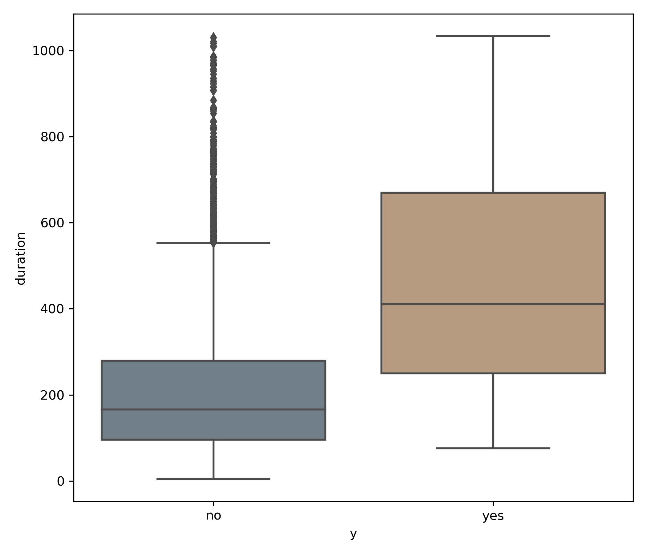
Utilizing this graphic, we can see that both the median (line in the center of the box) as well the interquartile range (IQR), or the upper and lower portions of the box as a whole, is greater for the yes than the no values.
A fantastic write up on Towards Data Science on how to interpret box plots: Understanding Boxplots
Histograms
Histograms show the distribution of a single variable in "bins" or groups of data based on the frequency of the occurrence of the value. Those not familiar with them might have a harder time reading these at first because they can be mixed up with bar charts. However, a bar chart plotting two variables on the X-Axis and Y-Axis, whereas the X-Axis in a histogram is the bin and the Y-Axis is the count in that bin.
sns.histplot(x='age', data=df, bins=20, kde=True)
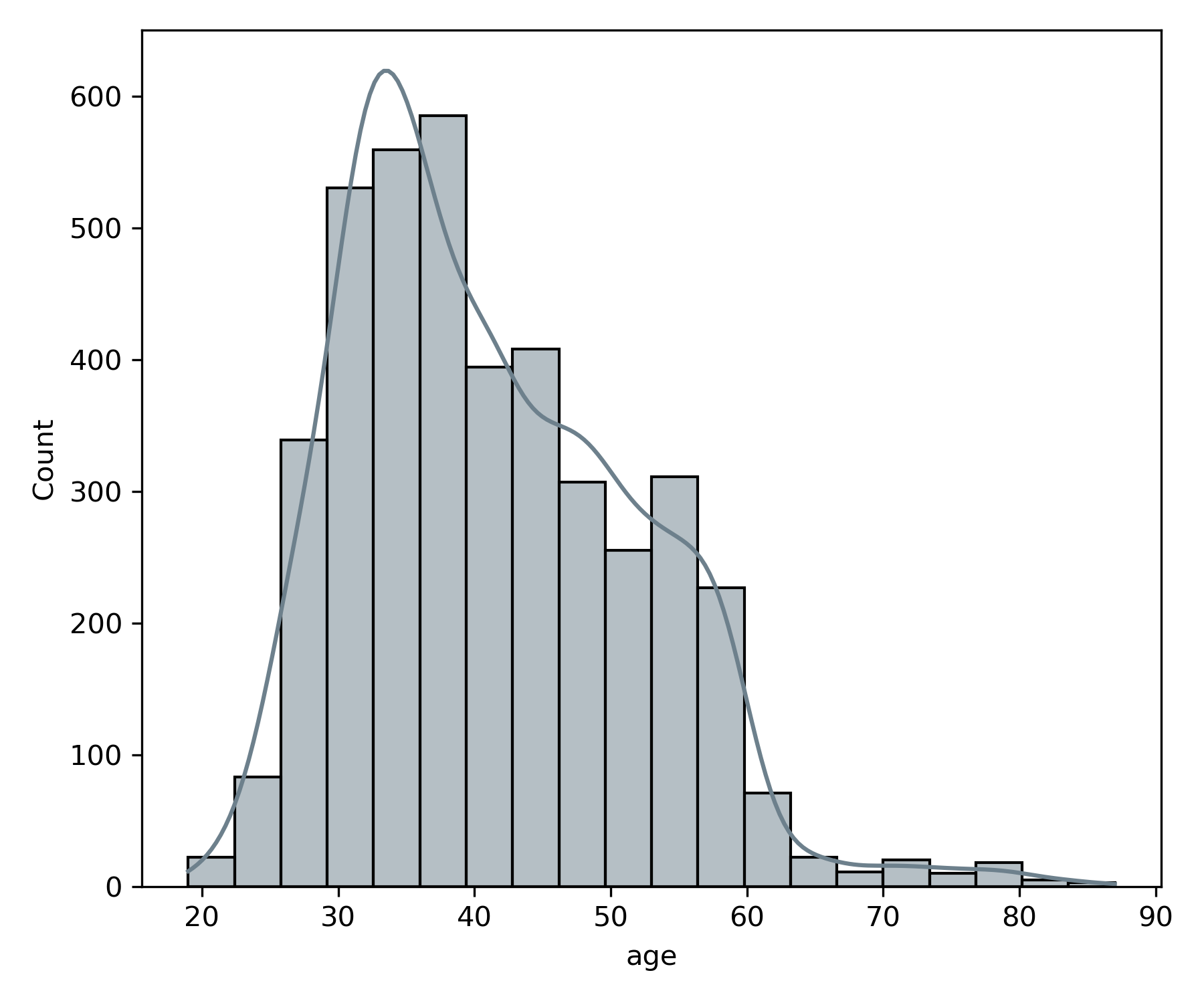
When you look at the age variable plotted with a histogram, you can see that the number of people in the data set with ages between 30 and 40 has the highest frequency. Because the histogram is not centered, we call this skewness. In this case, the skew is referred to as Right Skewed because the right tail is longer.
Bivariate Plots
Correlation Matrix
The absolute must bivariate (or multi-variate) plot you need to run is the correlation matrix. This is a matrix that shows the correlation between all the variables in the dataset. It will help you identify which variables are strongly correlated, for cases like simple linear regression or those that are not correlated, for cases when you're trying to models with multiple features adding to your model's performance.
 corr = df.corr()
f, ax = plt.subplots(figsize=(12, 8))
sns.heatmap(corr, annot=True, square=False, ax=ax, linewidth = 1)
plt.title('Pearson Correlation of Features')
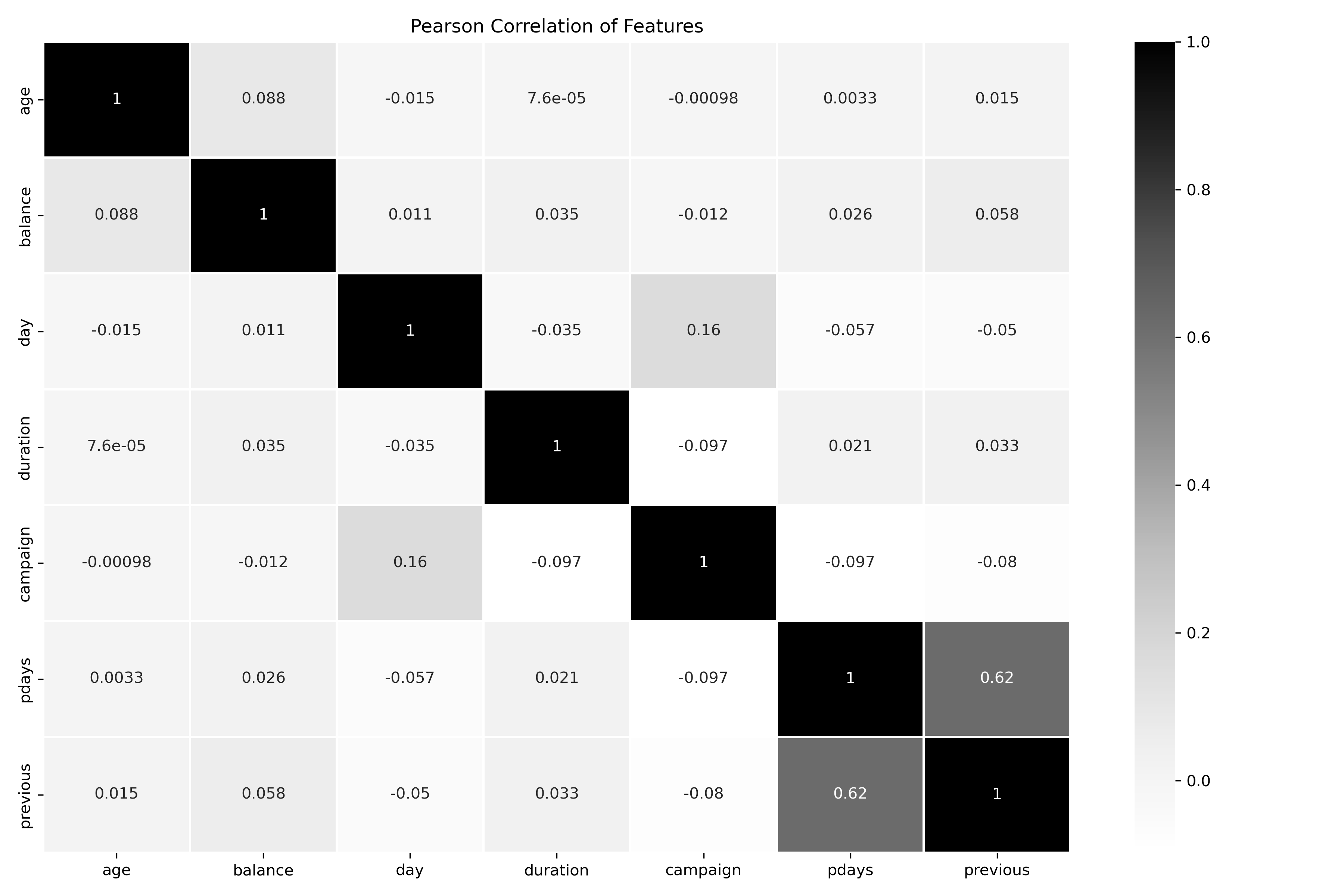
For the most part, there are not any strongly correlated variables except pdays and previous with a 0.62 positive correlation value between them. It would be valuable to understand why these are and if they're related to similar actions.
Pairplots
Next is a fantastic tool called Pair Plots. Similar to a correlation matrix, but giving you a scatterplot for each of the X and Y pairs. Down the diagonal is a KDE or Histogram of the variable.
 g.fig.set_size_inches(12,12)
g=sns.pairplot(df, diag_kind = 'auto', hue="y")
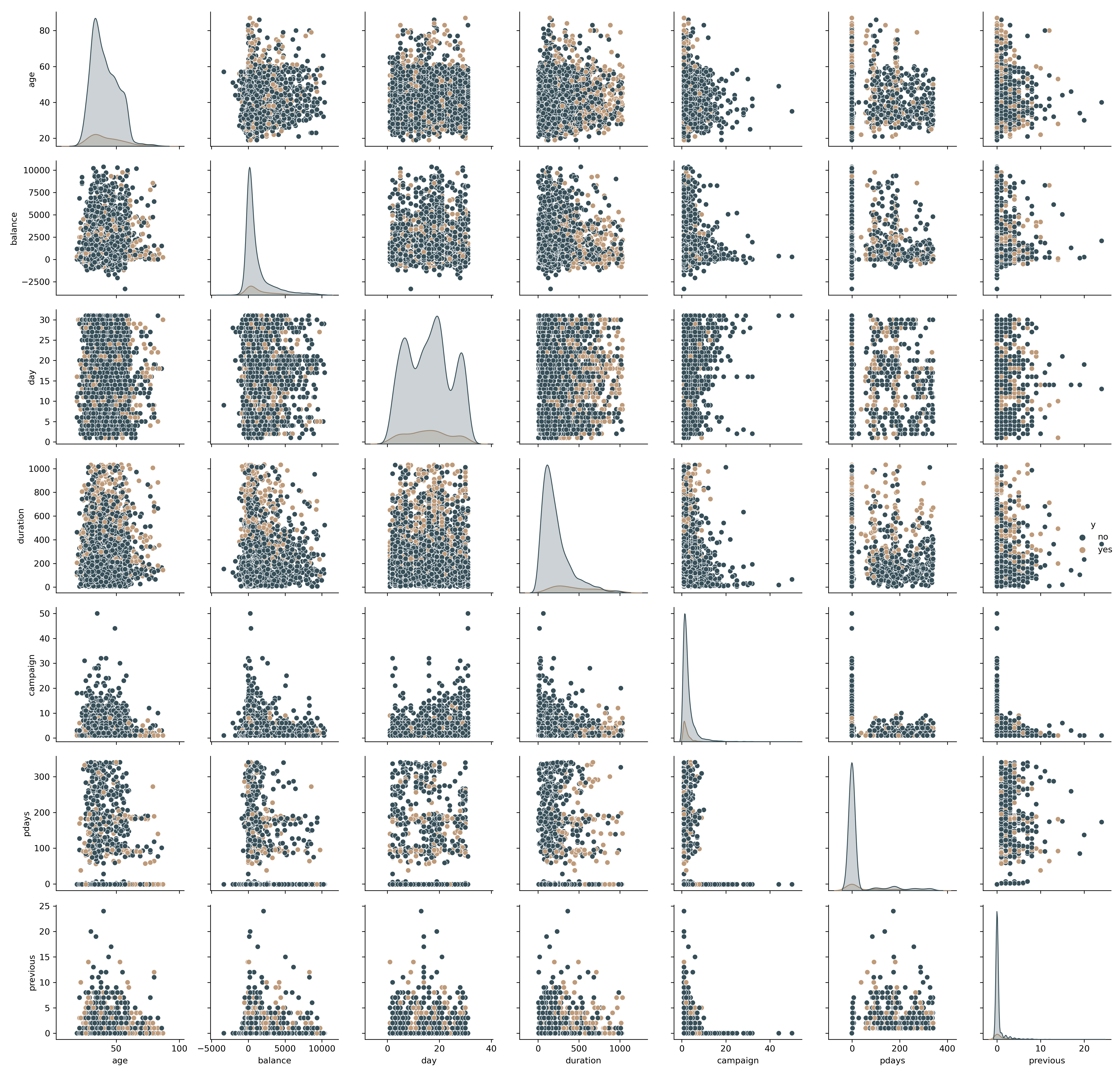
With just a single line of code, you can quickly, visually evaluate the relationships shown in the correlation matrix. We can see now visually there doesn't appear to be much of a correlation between the variable pdays and previous.
Additional Plots
From here, you can create any number of visuals to help you better understand the data. It's up to you to determine what story lies in the data. I have plenty of other examples in the Notebook on Github.
Conclusion
EDA is a powerful technique that you should get comfortable with every time you start working on a new dataset. There are plenty of other techniques out there that you can add to these basics. Go out there, explore and get to know your data before you jump into Machine Learning.

